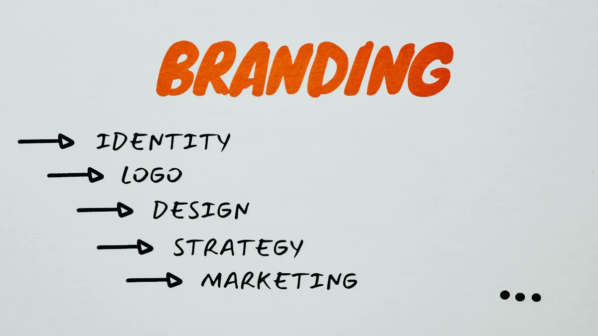
Does My Startup Need a Rebrand Before Fundraising?
A Startup Rebrand before fundraising is needed if your brand misaligns with goals or confuses investors. Assess clarity, timing, and market fit.
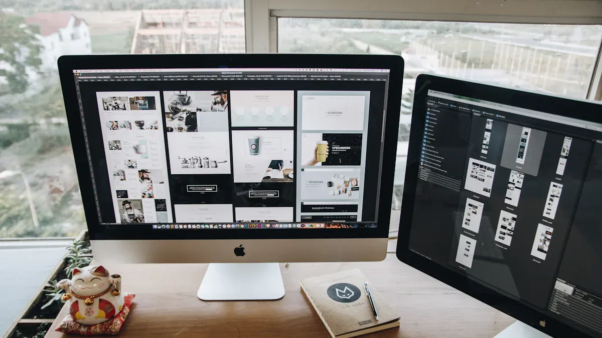
A well-designed website is essential for connecting with customers and growing your business online. Website design has evolved dramatically from basic HTML pages to rich, interactive experiences that engage visitors and drive real results. The most effective websites combine proven design principles with a deep understanding of how people interact with digital interfaces.
Good website design goes far beyond aesthetics – it's about creating an experience that works for your users and supports your business goals. From core usability and accessibility standards to mobile-first design and conversion optimization, mastering these fundamental concepts is key to building a site that performs. The principles that guide great web design have been refined through decades of research into human-computer interaction and user behavior.
This guide will walk you through 10 essential website design principles that every founder, entrepreneur and marketing leader needs to know. Whether you're evaluating your current site, planning a redesign, or working with a design team, you'll learn practical ways to create a website that both looks great and delivers measurable results for your business.
Visual hierarchy shapes how users experience and understand websites. By thoughtfully organizing page elements, designers can guide visitors' attention, help them scan content efficiently, and boost engagement. Good visual hierarchy makes websites both more user-friendly and more effective at achieving business goals.
Several design principles work together to create strong visual hierarchy:
Good visual hierarchy delivers several key advantages:
The principles of visual hierarchy build on work by influential designers like Dieter Rams and Josef Müller-Brockmann. Their focus on clarity and function continues to shape modern web design approaches.
Advantages:
Challenges:
By applying these visual hierarchy principles thoughtfully, you can create websites that both look good and work well. Clear visual organization helps visitors find what they need and take desired actions.
White space (or negative space) creates essential breathing room between website elements. When used well, it helps build clean, organized layouts that guide visitors naturally through your content. For website owners and marketers, mastering white space can dramatically improve both user experience and conversion rates.
White space comes in several key forms that serve different purposes:
Early websites often packed in information densely, competing for attention. As design principles matured and user experience became key, white space gained importance. Design movements like Bauhaus and Swiss Style typography showed how simplicity and breathing room could create more effective communication.
Good use of white space offers several advantages:
Advantages:
Challenges:
White space may seem simple, but its thoughtful use can dramatically improve how visitors experience your website. When properly implemented, it helps communicate your message clearly while creating a polished, professional impression.
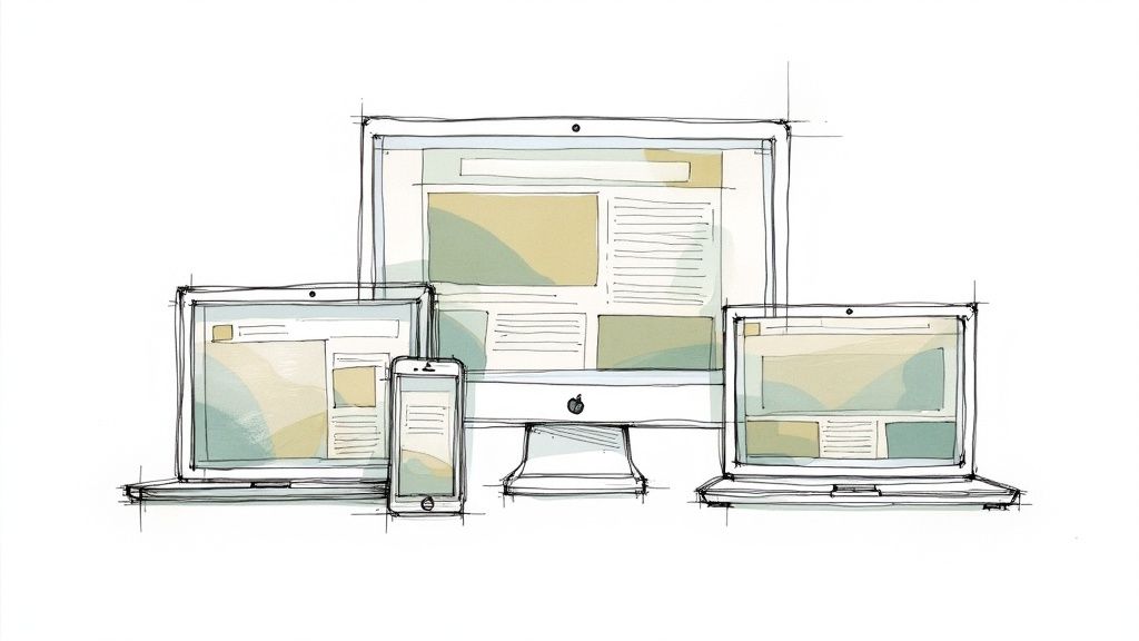
Responsive design makes your website adapt seamlessly to any screen size – from desktop monitors to smartphones. As mobile browsing continues to grow, having a website that works well on all devices has become essential for success.
The foundation of responsive design rests on several key elements:
Here's what makes responsive design so valuable:
Key Benefits:
Main Challenges:
Web pioneers like Ethan Marcotte and Luke Wroblewski helped establish responsive design as a standard practice. Major sites like Boston Globe, Smashing Magazine, and Microsoft.com show how responsive design creates seamless experiences across devices.
Implementation Tips:
For business owners and marketers, responsive design directly impacts success. When users can easily access your content on any device, you remove friction and make it simple for them to engage with your brand and take desired actions.
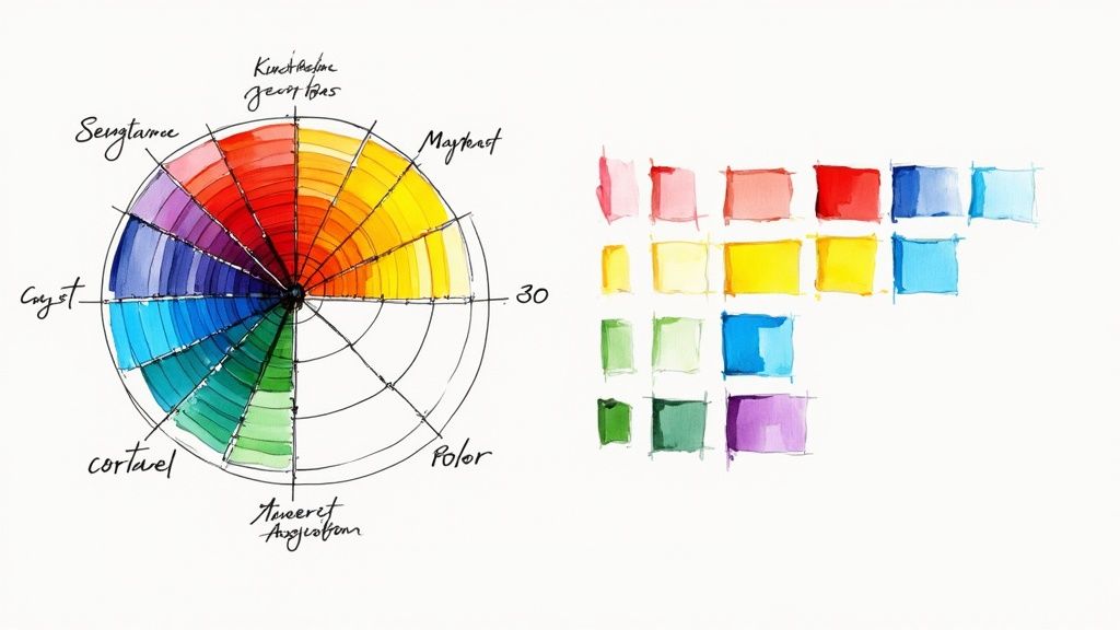
Color theory goes beyond aesthetics – it's a fundamental web design element that shapes how users experience and interact with your website. When used well, color helps communicate your message, guide user attention, and create lasting brand impressions.
Key Features of Color Theory in Web Design:
Benefits of Smart Color Usage:
Common Challenges:
Real Examples in Action:
Tips for Using Color Theory:
Web designers today have more color options than ever before. Early websites were limited by technical constraints, but modern sites can use color in sophisticated ways to improve the user experience. By understanding core color principles, you can create designs that both look good and help achieve your business goals.
Good typography hierarchy is key to effective web design. It creates a clear visual order that helps users read and navigate your website easily. When done right, it helps your content flow naturally and strengthens your brand identity.
Typography hierarchy works through several key elements:
As websites have become more content-focused, good typography has become essential. Many early websites had messy, hard-to-read text layouts. Today's successful sites use careful typography planning to help users engage with content.
Real Examples:
Benefits:
Challenges:
Tips for Success:
Read also: Website Typography Best Practices for optimizing font loading and performance.
By focusing on these typography principles, you can create content that's both visually appealing and easy for your audience to read and understand.
Grid systems provide the essential structural framework for organizing content on websites. They ensure visual consistency and make responsive design possible across different devices. For anyone managing a website, understanding how grid systems work is key to creating a professional and user-friendly experience.
Think of a grid system like a blueprint. It uses vertical and horizontal lines to divide your page into columns and rows. This structured approach helps align elements precisely and creates clean, organized layouts. When implemented well, grid systems make content easier to scan and navigate.
Key Features and Benefits:
Why Grid Systems Help:
Grids speed up the design process by providing a ready-made structure. Rather than starting from zero, designers can place content within established grid frameworks. This approach ensures a unified look across all pages. Having responsive breakpoints built in from the start also makes mobile optimization much simpler.
Advantages and Limitations:
Advantages:
Limitations:
History and Real-World Examples:
Grid systems in design trace back to Swiss designer Josef Müller-Brockmann and later evolved for web use through Mark Boulton's work. Today, grids are everywhere online. Notable examples include Bootstrap, Material Design, and The Guardian. Studying these sites shows grids in action.
Tips for Using Grids:
By implementing grid systems thoughtfully, you can create websites that look polished, work smoothly across devices, and provide an excellent user experience. This structured approach helps ensure your site achieves its core goals.
Well-designed navigation is key to keeping users engaged and happy on your website. It helps visitors move smoothly through your content and find exactly what they're looking for. For businesses, good navigation means more time spent on your site, fewer people leaving early, and better results. This makes it a vital part of any website design strategy.
Think of navigation as your site's GPS – it needs to help visitors find their destination with minimal effort. This comes down to organizing your content logically, using clear labels, and offering different ways for people to move around your site.
Key Elements of Good Navigation:
Benefits:
Challenges:
Real Examples in Action:
Tips for Better Navigation:
Want to learn more? Check out: Understanding Website Structure and its Impact on SEO. This guide explores how your site organization affects search rankings.
Website navigation has grown alongside web technology – from basic text links to today's interactive menus. Modern navigation focuses on creating an experience that helps users accomplish their goals with minimal friction. Read more: [Best Practices for Mobile Navigation Design].
A well-designed website relies on consistency across all its elements to create a seamless user experience. When key components like buttons, menus, and forms work predictably on every page, users can focus on your content rather than figuring out how things work.
What does consistency mean in website design?
Here are the main types of consistency to consider:
Why consistency matters
Consistent design provides several key benefits:
Potential challenges to consider:
Real-world examples:
Leading tech companies demonstrate consistency through comprehensive design systems:
Tips for implementation:
For business owners and marketers, consistency in website design is key to providing a great user experience and building a strong brand. When done right, it helps visitors focus on your content and offerings rather than getting frustrated by unpredictable interfaces.
Speed and efficiency matter greatly in modern web design. A responsive, smooth-running website keeps visitors engaged, ranks better in search engines, and drives better business results. Slow loading times and clunky performance can quickly drive users away before they even explore your content.
Here are the key aspects of performance optimization:
The growth in mobile internet usage has made performance critical. Mobile users often have slower connections and less patience for delays. Google now considers page speed when ranking sites, making fast-loading pages essential for visibility.
Benefits of Performance Optimization:
Challenges to Consider:
Success Stories:
Key Implementation Tips:
By making performance optimization a priority, website owners can significantly improve user experience, search visibility and business results. The initial effort pays off through better engagement and conversions.
Good website design means creating sites that work for everyone, no matter their abilities. This includes people with visual, hearing, physical, or cognitive disabilities. When you ignore accessibility, you not only miss out on potential visitors but also create barriers for a significant part of your audience. That's why accessibility has become a key part of modern web design.
For business leaders and marketers, focusing on accessibility leads to better reach, a stronger brand image, and meeting legal requirements. It's not optional anymore – it's essential for building a successful website that serves all users.
The web has come a long way in supporting users with disabilities. Early sites often overlooked accessibility entirely. But with the creation of the Web Content Accessibility Guidelines (WCAG) by the W3C, we now have clear standards that help make the web work better for everyone.
Key accessibility features include:
<nav> for navigation) helps both users and assistive technologies understand your siteSome great examples of accessible websites include GOV.UK, the BBC, and W3C. These sites show how accessibility can blend seamlessly into good design while serving all users well.
Benefits of accessibility:
Challenges to consider:
Tips for Making Your Site Accessible:
For more insights, check out our guide on website structure and sitemaps. A clear sitemap like this example helps both search engines and users – especially those using assistive tech – understand how your site is organized.
| Title | 🔄 Implementation Complexity | ⚡ Resource Requirements | 📊 Expected Outcomes | 💡 Ideal Use Cases | ⭐ Key Advantages |
|---|---|---|---|---|---|
| Visual Hierarchy | Moderate design effort; requires iterative testing and balance | Medium; demands careful adjustments and periodic reviews | Enhanced scanability and user comprehension | Content-rich sites like news, ecommerce, blogs | Establishes clear focal points and supports business goals |
| White Space | Simple to moderate; relies on consistent spacing and balance | Low; minimal resource allocation once guidelines are set | Improved readability and reduced visual clutter | Clean, minimalist designs and modern interfaces | Elevates clarity and focuses user attention |
| Responsive Design | High; involves multiple breakpoints and extensive mobile testing | High; requires significant coding and device-specific testing | Optimal experience across devices with SEO benefits | Multi-device platforms and mobile-first sites | Future-proof design with scalable, adaptive layouts |
| Color Theory | Moderate; demands design expertise with careful testing | Moderate; involves research for cultural and accessibility needs | Evokes emotional responses while guiding user attention | Branding projects and visually engaging interfaces | Enhances brand recognition and overall usability |
| Typography Hierarchy | Moderate; requires careful font pairing, scaling, and consistency | Low to medium; depends on font management and load performance | Boosts readability and organizes content effectively | Editorial, content-heavy, and information-rich sites | Strengthens clarity and reinforces brand identity |
| Grid Systems | Simple to moderate; some learning curve for effective modular layouts | Low; efficient once the grid framework is established | Achieves consistent layouts and speeds up the design process | Websites needing structured, modular design | Creates visual order and facilitates responsive design |
| Navigation Design | Moderate; may become complex with extensive menu structures | Medium; iterative testing for desktop and mobile adaptations | Enhances user experience by reducing bounce rates and increasing engagement | Complex sites with diverse content and multiple navigation layers | Simplifies user journey and improves information access |
| Consistency | Simple to moderate; easier with established design systems and guidelines | Low; benefits from standardized style guides | Reduces cognitive load and builds user trust | Brands and interfaces focusing on uniformity | Strengthens predictability and learnability |
| Performance Optimization | High; entails technical expertise and continuous refinement | High; intensive resources for coding, testing, and maintenance | Results in faster load times, improved SEO, and lower bounce rates | High-traffic, eCommerce, and media streaming sites | Greatly boosts efficiency and enhances overall user satisfaction |
| Accessibility | Moderate to high; requires adherence to standards and thorough testing | Moderate; involves ongoing updates and compliance audits | Ensures inclusive usability and meets legal compliance standards | Public, government, and educational websites | Broadens audience reach and significantly improves usability |
The key to building a great website lies in carefully combining essential elements like visual structure, whitespace, responsive design, and thoughtful color choices. Good typography and grid layouts help organize content effectively, while clear navigation ensures visitors can find what they need. When all these pieces work together consistently, they strengthen your brand and create a polished experience. Making your site accessible to everyone shows you care about all users.
Working with these design principles takes careful planning. Start by understanding exactly who will use your site and what they need from it. Then choose which elements matter most for your goals. For example, if most visitors browse on phones, focus heavily on mobile-friendly design. If visual impact drives your brand, put extra attention into colors and imagery. Test different approaches to see what connects best with your audience.
Website design keeps advancing as technology and user habits change. New capabilities emerge and expectations evolve. Watch for impactful developments in areas like web accessibility and AI-powered personalization. By staying open to learning and refining your approach, you can keep your site relevant and impactful.
Key Takeaways:
Creating an effective website involves many moving parts and important decisions. If you're looking for expert help bringing your vision to life, LaunchBox can help. As a full-service design subscription, we provide branding, web design, packaging design and animation for e-commerce companies, startups and biotech firms. Our experienced team handles the complex design work so you can concentrate on growing your business. Visit LaunchBox to learn how we can enhance your online presence.


You can! But a senior designer can command $30K a month. Also, depending on your needs, they may not be able to do all that’s required. Fractional design partners like LaunchBox bring a range of skills and and a lot of experience for an affordable monthly rate.
Good question. This depends a lot on you, but we can do a lot if we work well together. For example, it’s reasonable for us to deliver a brand, website, merch, presentations, and print/packaging in a month.
No, there are no refunds, but you can pause, cancel, upgrade or downgrade your subscription any time. We also offer a risk-free no-card-needed trial so you can test LaunchBox for yourself!
The source files are yours, and you will have access to them during the entire subscription.
We produce video and animation using Blender and Resolve. We build sites in Framer, and Wordpress. We design using Affinity Designer and Figma. We can also adapt to your needs.
You add tasks to a shared Trello board and we’ll deliver on the task within 48 hours. Tasks are updated and links are added to the board. The board holds everything. We provide task templates so you can see a roadmap for most project types when creating tasks.