
Does My Startup Need a Rebrand Before Fundraising?
A Startup Rebrand before fundraising is needed if your brand misaligns with goals or confuses investors. Assess clarity, timing, and market fit.
Having a responsive website is essential in our mobile-first world. Remember pinching and zooming on tiny screens just to read website text? Responsive design has made those days a thing of the past. We're no longer designing for a single screen; we're building dynamic experiences that adapt to any device, from smartphones to large desktop monitors. Understanding responsive design is crucial for founders, entrepreneurs, and marketing professionals, as it directly impacts user experience, conversion rates, and online success.
This shift wasn't accidental. As internet use moved from desktop to mobile, the need for adaptable web design became clear. Effective responsive design isn't about shrinking or enlarging content; it's about reorganizing and prioritizing elements for optimal usability and a consistent brand experience, regardless of screen size. This involves using flexible grids, images, and typography, along with content prioritization and thorough testing.
This guide presents 10 essential responsive design best practices for creating websites that look great and perform flawlessly across various devices. By implementing these strategies, you'll be on your way to delivering engaging web experiences that captivate your audience and drive business growth.
In today's world, where mobile devices reign supreme, responsive design is essential for any successful website. A core principle of achieving this responsiveness lies in adopting a mobile-first approach. This strategy prioritizes designing for smaller screens, like smartphones, before enhancing the experience for larger screens such as tablets and desktops. This ensures that core content and functionality are optimized for mobile users before adding more complex elements.

This methodology builds upon the concept of progressive enhancement, starting with a strong, functional base and gradually adding layers of enhancement as screen size increases. This encourages designers to focus on what truly matters: essential content and a smooth user experience. Addressing mobile constraints from the beginning inherently prioritizes performance optimization, resulting in faster loading times and a seamless user journey across all devices.
The mobile-first approach aligns with the ever-increasing number of users accessing the internet through their smartphones. By prioritizing mobile, you cater to the largest segment of your audience. It creates a robust foundation that scales seamlessly, rather than squeezing a desktop experience onto a smaller device.
Pros:
Cons:
Successful mobile-first implementations include Google's Material Design, Twitter's Responsive Web Interface, and Amazon's Mobile Shopping Experience.
Tips for Implementation:
min-width for progressive enhancement.The mobile-first approach, popularized by industry leaders like Luke Wroblewski and Ethan Marcotte, author of Responsive Web Design, has become foundational for creating user-friendly experiences. For founders, entrepreneurs, and marketing managers, understanding this approach is essential for effectively reaching and engaging your target audience. For additional resources, check out Our Sitemap.
Fluid grid layouts are essential for responsive web design. They ensure your website adapts smoothly to any screen size. Unlike fixed-width layouts that rely on pixels, fluid grids use relative units like percentages, ems, or rems. This allows the layout to resize and reflow content proportionally to the viewer's device. This creates a consistent user experience whether on a desktop, tablet, or smartphone. This adaptability is a cornerstone of modern responsive design.

Think of the layout as columns and rows that expand and contract like an accordion. Content inside these flexible containers automatically reflows to fit the available space. A three-column layout on a desktop, for example, could transform into a single-column stack on a mobile phone, preserving readability and visual appeal. This dynamic adjustment happens by defining element widths as percentages of their parent container.
Fluid grids offer numerous advantages.
However, there are a couple of potential drawbacks to consider.
Several prominent websites showcase the effectiveness of fluid grids:
Ethan Marcotte popularized fluid grids in his 2010 article. Frameworks like Bootstrap, with its 12-column grid system, solidified fluid grids in web development.
Here are a few helpful tips when implementing fluid grids:
By using fluid grid layouts, founders, marketers, and product managers ensure their websites offer a better user experience, reaching a broader audience and maximizing engagement across devices. This adaptable design approach is essential for competitiveness in today's multi-device environment.
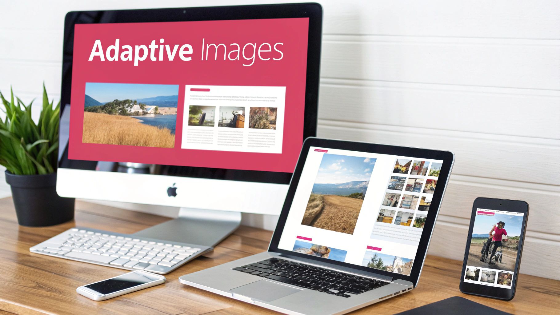
In responsive design, images are key. Simply shrinking a large image down doesn't cut it. This wastes bandwidth and slows down page load times, hurting the user experience. This is where responsive images come in. They are a fundamental best practice, ensuring optimal image quality and performance across various devices.
Responsive images adapt to different screen sizes, resolutions, and device capabilities. They achieve this by loading appropriately sized image files according to the user's context. Instead of downloading one large image and resizing it on the client-side, the browser selects the best image from a set of options. This improves both visual quality and website performance.
Resolution Switching: Serves different image resolutions using HTML attributes like srcset and sizes. High-DPI displays receive crisp images, while lower-resolution screens get smaller, optimized versions.
Art Direction: The <picture> element allows for different image crops or even entirely different images for various aspect ratios. This ensures the most impactful visual, regardless of screen size.
Bandwidth Optimization: By avoiding oversized images, responsive images drastically reduce page load times. This is especially important for users on limited data plans or slower connections, leading to a better user experience and improved conversion rates.
Maintained Visual Quality: Images look sharp and clear on all devices, from large desktop monitors to small mobile screens.
Let's look at the advantages and disadvantages of using responsive images:
| Pros | Cons |
|---|---|
| Reduces page load times | Requires creating and maintaining multiple image versions |
| Improves user experience on high-DPI displays | Implementation can be initially complex |
| Saves bandwidth | Older browser support inconsistencies (largely resolved now) |
| Maintains visual quality across devices |
<picture> element: This offers maximum flexibility for art direction, allowing you to tailor images based on media queries.srcset and sizes attributes: These attributes in the <img> tag enable resolution switching.The Responsive Images Community Group (RICG), led by Mat Marquis, and experts like Jason Grigsby were key in developing and promoting responsive image specifications. Their work has greatly improved the web experience for users globally.
For founders, entrepreneurs, and marketing professionals, responsive images are crucial. They enhance user experience, improve SEO, and drive business success. Prioritizing image optimization ensures your website delivers a fast, engaging experience on any device, leaving a positive impression on your audience.
A robust breakpoint strategy is essential for responsive web design. It determines how a website adapts to different screen sizes, ensuring content remains accessible and visually appealing on any device, from smartphones to large desktop monitors. Modern breakpoint strategies focus on the content rather than targeting specific devices, identifying points where the layout needs to shift for usability and visual consistency.
A breakpoint strategy involves defining specific viewport widths at which the website's layout changes. These changes are implemented using CSS media queries, which apply different styles based on screen size. This allows for adjustments such as changing the number of columns in a grid, modifying font sizes, or repositioning elements to create an optimal experience for each screen size.
With the wide variety of devices used to access the internet, a solid breakpoint strategy is essential for effective audience reach. Without it, a website might be unusable or visually unappealing on certain devices, resulting in a poor user experience and lost conversions.
Early responsive design often relied on device-specific breakpoints (such as targeting iPhone resolutions). However, the growing number of devices made this approach unsustainable. The shift toward content-driven breakpoints, championed by figures like Brad Frost and popularized by frameworks like Bootstrap, became the standard. Bootstrap, with its predefined breakpoint system, simplified responsive design implementation. Tailwind CSS further refined the concept with highly customizable breakpoint configurations.
By implementing a content-driven breakpoint strategy and using these tips, founders, marketers, and product managers can ensure their websites provide a consistent and engaging user experience across all devices, maximizing reach and impact.

Creating a visually appealing responsive website is only part of the equation. Equally important is performance optimization. This means ensuring a fast, smooth user experience on any device, especially given the limitations of mobile networks and hardware. For founders, entrepreneurs, and product managers, understanding this concept is vital for attracting and retaining users, increasing conversions, and building a strong online presence. A slow website can quickly lead to user frustration, high bounce rates, and lost revenue.
Performance optimization is a key element of any effective responsive design strategy.
What does performance optimization entail? It involves minimizing file sizes (HTML, CSS, JavaScript, images), reducing HTTP requests, implementing smart loading strategies, and prioritizing content rendering (the critical rendering path).
Let's take a closer look at some of the key features:
Critical CSS Loading for Above-the-Fold Content: This technique prioritizes loading the styles needed for the content immediately visible upon page load. This ensures a fast initial render, with the rest of the CSS loading asynchronously.
Asset Minification and Compression: Removing unnecessary characters from code and compressing files reduces their size, resulting in faster downloads.
Lazy Loading of Non-Critical Resources: Images and videos below the fold load only when the user scrolls to them, improving initial page load speed.
Responsive Image Optimization: Serving appropriately sized images to each user's device prevents downloading unnecessarily large files. This can be done using the <picture> element or the srcset attribute.
Server-Side Optimizations (Caching, Compression): Leveraging browser caching and server-side compression further enhances performance by minimizing data transfer.
Like any strategy, performance optimization has its benefits and drawbacks.
Pros:
Improved User Experience: Fast loading and smooth interactions create a positive user experience, especially on mobile networks.
Reduced Bounce Rates: A fast website keeps users engaged and less likely to leave before exploring your content.
Positive SEO Impact: Search engines like Google favor fast-loading websites, potentially leading to higher search rankings.
Lower Bandwidth Costs: Reduced file sizes mean lower bandwidth costs for both users and website owners.
Increased Conversion Rates: Faster loading times, particularly for e-commerce sites, can directly boost conversion rates.
Cons:
Increased Development Complexity: Implementing certain performance techniques can add complexity to the development process.
Ongoing Monitoring and Maintenance: Performance requires constant monitoring and adjustments to maintain optimal results.
Potential Tradeoffs: Sometimes, there might be tradeoffs between features and speed.
Performance optimization isn't just theory. Industry leaders have championed its importance, including Steve Souders (performance pioneer at Yahoo! and Google), Addy Osmani (Google performance engineer), and Harry Roberts (CSS performance expert). Their work has significantly shaped performance best practices and tools.
Here are some real-world examples:
Google's AMP (Accelerated Mobile Pages): A framework for building lightweight mobile pages that prioritize speed.
Financial Times: Known for its performance-focused approach, the Financial Times prioritizes speed as a core element of its user experience.
Pinterest's Gradual Loading Strategy: Pinterest loads content progressively, ensuring a smooth experience even on slower connections.
Finally, here are some practical tips for implementation:
Regularly audit performance with tools like Lighthouse or WebPageTest.
Optimize images and fonts. Use modern formats like WebP for images and variable fonts to minimize file sizes.
Minimize third-party scripts and assess their performance impact.
Establish a performance budget for your project.
Implement code-splitting for JavaScript bundles.
By prioritizing performance optimization, businesses can build responsive websites that not only look great but also provide a fast, engaging, and successful user experience.
Designing for touch interaction isn't just a nice-to-have anymore; it's a necessity. A touch-friendly interface ensures your website or app is easy to use on smartphones and tablets, creating a smoother, more enjoyable experience. This means thinking about how fingers, rather than mouse pointers, interact with your site.
Why is this so important for responsive design? A large portion of your audience uses touch devices to access the web. If you don't optimize for these users, you risk alienating a significant segment of your market and impacting your bottom line.
pointer: coarse media queries to detect touch interfaces and apply specific styles.The rise of touch-friendly design is directly tied to the popularity of smartphones. Apple pioneered this with the iPhone and its iOS Human Interface Guidelines, shifting the focus from mouse-precise interactions to finger-based navigation. Mobile UX pioneers like Luke Wroblewski also contributed significantly. Google's Material Design guidelines further solidified the importance of touch target specifications.
By implementing these touch-friendly best practices, you'll create a more user-friendly and accessible experience, leading to greater engagement and satisfaction.
In responsive design, flexible typography is essential. It guarantees text remains legible and visually appealing on any device, from smartphones to desktops. This adaptability is key for a consistent user experience and maintains design integrity regardless of screen size.
Flexible typography dynamically adapts text size, line height, and spacing. Instead of fixed pixel values, it uses relative units like em and rem for font sizing. Viewport units, like vw and vh, scale elements relative to the browser window. This lets text scale proportionally with the screen, ensuring readability and visual harmony.
Variable line heights, adjusted by context, further enhance readability. This prevents cramped text on smaller screens and excessive spacing on larger ones. A proportionally adjusting typographic hierarchy ensures headings and body text retain their relative importance and visual distinction at any size. Setting minimum and maximum font sizes provides boundaries, preventing text from becoming too small or too large at extreme screen sizes.
Flexible typography offers numerous advantages.
Implementing truly flexible typography can be challenging. It requires thorough testing across many screen sizes and resolutions. Fallbacks may be needed for older browsers lacking full support for modern CSS features.
Real-world examples demonstrate the power of flexible typography. Medium's article typography gives a seamless reading experience regardless of device. The New Yorker's responsive design maintains elegant typography across screens. GitHub's documentation system ensures code and text remain clear and legible on any device.
Here are some practical tips for implementing flexible typography:
calc() and viewport units (vw, vh).html element: Use rem units throughout your styles.Pioneers like Tim Brown (author of "Type is Responsive") and Jason Pamental (a responsive typography advocate), along with the Adobe Type team, have significantly advanced flexible typography. For more design principles, see: Our guide on….
Flexible typography is a responsive design best practice. It directly addresses readability, a crucial aspect of user experience. Ensuring legible and visually appealing text on every device enhances user engagement and contributes to a positive user experience. This is especially important for founders, entrepreneurs, marketing managers, product marketing managers, and product managers focused on delivering a compelling and accessible online presence.
Creating a website that looks fantastic and works seamlessly on any device, from a large desktop monitor to a small smartphone screen, is crucial for success. This is where modern CSS layout technologies, like Flexbox and Grid, truly excel. They have simplified responsive design, providing powerful tools to build adaptable layouts with much less code than older methods. This makes them an essential best practice for any modern website.
Before Flexbox and Grid, building complex responsive layouts often involved tricky workarounds using floats, clearfix, and lots of media queries. These older methods were notoriously difficult to maintain and prone to breaking. Flexbox and Grid dramatically streamlined the process, enabling developers to create sophisticated arrangements with less code and better browser compatibility.
Flexbox (Flexible Box Layout) is ideal for managing one-dimensional layouts – either a single row or a single column. It offers detailed control over alignment, distribution, and the order of items within a container. This makes it perfect for components like navigation menus, card layouts, and small UI elements.
Grid (CSS Grid Layout), on the other hand, allows developers to control two-dimensional layouts, working with both rows and columns at the same time. This enables intricate grid systems, complex website layouts, and a level of design control that previously required frameworks like Bootstrap or JavaScript.
Intrinsic Sizing: Features like min-content and max-content allow elements to automatically size themselves based on their content, creating more dynamic and responsive layouts.
Auto-Placement and Auto-Filling: Grid automatically places and sizes items within the defined grid area, reducing manual adjustments and further streamlining the layout process.
Gap Properties: Managing consistent spacing between grid items is easy with gap properties (gap, row-gap, column-gap), removing the need for margins and padding workarounds.
Combined Power: Flexbox and Grid work very well together. Use Grid for the overall page layout and then use Flexbox for finer control within individual grid areas.
Here's a quick overview of the advantages and disadvantages:
| Feature | Pros | Cons |
|---|---|---|
| Overall | Simplified responsive layouts, enhanced control, enables complex layouts | Learning curve, browser support for some advanced features |
Several prominent websites utilize Flexbox and Grid:
Mozilla Developer Network (MDN): MDN uses Flexbox and Grid throughout its website for a responsive and well-structured layout.
Smashing Magazine: Known for its web design articles, Smashing Magazine often showcases examples of Flexbox and Grid.
Stripe Documentation: Stripe's documentation uses these technologies to present complex information clearly and organized.
Choose the Right Tool: Flexbox for one-dimensional layouts, Grid for two-dimensional layouts.
Leverage the fr Unit: The fr unit creates fluid and flexible grid layouts.
Combine Flexbox and Grid: Use both for complex UI components and layouts.
Progressive Enhancement with @supports: The @supports rule provides fallback styles for browsers that don't support specific features.
Key figures in the popularization of Flexbox and Grid include Rachel Andrew (a Grid layout expert), Jen Simmons (creator of Layout Land), and the CSS Working Group at the W3C. Their advocacy and educational efforts have been vital for the widespread adoption of these technologies.
By using these modern CSS layout technologies, founders, entrepreneurs, and marketing managers can ensure their websites provide a great user experience on all devices, leading to increased engagement and better results. Understanding and implementing these techniques is essential for building a successful online presence.
Content prioritization is a cornerstone of responsive design. It ensures users can easily find the most important information, no matter what device they're using. This involves strategically arranging and displaying content based on its importance across different screen sizes. Essentially, it means the core message or key functionality isn't buried under less important details on a smaller screen.
By prioritizing content effectively, you cater to users' immediate needs and create a smoother, more engaging experience. This is key for founders, entrepreneurs, and product/marketing managers aiming to maximize conversions and user satisfaction across all platforms.
This practice has become increasingly important because of the many different devices people use to access the web. We can no longer assume everyone is browsing on large desktop monitors. Smartphones, tablets, and other devices with varying screen sizes are now the norm. Experts like Karen McGrane, a prominent content strategy expert, Jakob Nielsen, a renowned usability researcher, and Luke Wroblewski, a mobile UX pioneer, have emphasized content prioritization for optimal user experiences.
Content prioritization relies on several key features:
order or Grid: These CSS properties offer flexible layout adjustments.Content prioritization is essential for building successful digital experiences. By prioritizing content, businesses can effectively communicate their message, regardless of how users access it.
Responsive design is a powerful tool, but its effectiveness hinges on proper implementation. A visually stunning responsive website can quickly become unusable if it's not thoroughly tested. This testing needs to happen across the diverse range of devices, browsers, and network conditions that your users will encounter. This is where responsive testing methodologies become essential. They provide a systematic way to evaluate your website, ensuring a consistent experience regardless of how someone accesses it. This covers everything from visuals and interactions to performance, using both automated and manual approaches.
Why is responsive testing so vital? Because it validates your design assumptions. You might believe your site works perfectly on an iPhone 13, but how does it fare on an older Android device with a limited data plan? Is navigation still intuitive on a tablet in landscape mode? Testing provides the answers, helping you identify and address potential problems before they impact your users.
Effective responsive testing incorporates several crucial features:
The benefits of incorporating these features are substantial. They include early issue identification, consistent cross-platform experiences, validation of design choices, and maintaining quality as your site grows.
However, responsive testing also presents some challenges. Thorough testing can be time-consuming, especially without automation. Testing every possible device and browser combination is practically impossible. As new devices and browsers emerge, ongoing investment in testing remains necessary.
Leading organizations like The Guardian, Salesforce, and the BBC understand the importance of responsive testing. They have implemented robust multi-device testing frameworks to ensure their content reaches a global audience seamlessly. These companies recognize that a positive user experience, irrespective of device, is critical for engagement and brand loyalty.
You might also find valuable resources on our Launchbox sitemap for more information on design and development best practices.
Here are some practical tips for implementing effective responsive testing:
Industry pioneers like Brad Frost and Ethan Marcotte, along with platforms like Browserstack, have significantly advanced the field of responsive testing. Their advocacy and tools have simplified the process of implementing and maintaining truly responsive designs.
Meticulous responsive testing is an essential best practice for responsive design. It's the final, crucial step that ensures a flawless user experience, directly impacting your website's success.
| Strategy | 🔄 Complexity | ⚡ Resources | 📊 Outcomes | 💡 Use Cases | ⭐ Advantages |
|---|---|---|---|---|---|
| Mobile-First Approach | Moderate; requires careful content hierarchy planning | Minimal initially; leverages mobile constraints | Optimized mobile experience that scales to larger screens | Mobile-centric design; startups, high mobile traffic sites | Focus on essentials; performance gains; scalability |
| Fluid Grid Layouts | Moderate to high; demands precise proportional planning | CSS-based; requires modern design tools | Consistent, flexible layout that adapts smoothly across screen sizes | Responsive, content-rich websites | Smooth scalability; design consistency; reduced layout duplication |
| Responsive Images | High; involves managing multiple image versions and HTML attributes | Higher asset management with image processing tools; more setup effort | Optimal image quality with reduced load times and efficient bandwidth usage | Media-heavy sites; high-DPI display environments | Reduced bandwidth; efficient image loading; high visual quality |
| Breakpoint Strategy | Moderate; relies on setting well-considered content-driven breakpoints | Standard media-query technologies; moderate setup effort | Smooth content adaptation with predictable layout changes | Adaptive design frameworks; sites with varied content structures | Predictable changes; content-driven adjustments |
| Performance Optimization | High; complex implementation with multiple optimizations involved | Requires additional tools and continuous monitoring (compression, caching, etc.) | Faster load times, improved SEO and conversion rates | Speed-critical applications; e-commerce, media sites | Improved UX; lower bounce rates; enhanced conversions |
| Touch-Friendly Interfaces | Low to moderate; design adjustments and extensive testing on real devices | Minimal extra resources; primarily design refinements | Enhanced usability and intuitive interaction on touch-based devices | Mobile apps, tablet interfaces, kiosks | Better accessibility; reduced user errors; future-proof design |
| Flexible Typography | Moderate; demands systematic scaling and cross-browser testing | Minor resource impact; mainly CSS adjustments with modern units | Readable and visually balanced text across devices | Content-driven sites; blogs, online magazines | Consistent visual harmony; less manual tweaks; maintained design intent |
| CSS Layout Technologies | Low to moderate; modern techniques simplify complexity despite a learning curve | Relies on modern CSS; lower runtime resource usage; may need fallbacks for legacy support | Simplified responsive layouts with versatile design arrangements | Web apps, dashboards, complex UI designs | Streamlined code; versatile layouts; minimal reliance on media queries |
| Content Prioritization | Moderate; requires strategic planning and content hierarchy determination | Involves content auditing and deliberate design strategy; moderate resource input | Critical content remains prominent with improved user engagement | News sites, e-commerce product pages, information portals | User-focused; clear content hierarchy; enhanced engagement |
| Responsive Testing Methodologies | High; extensive testing across devices, browsers and conditions | Requires investment in real devices, emulators, and automated testing tools | Reliable, consistent performance and appearance across platforms | QA processes; large-scale projects; cross-platform deployments | Proactive issue detection; high quality assurance; comprehensive coverage |
Building a website today isn't just about visuals; it's about crafting an engaging experience that works seamlessly on any device. This is where responsive design comes in. By following best practices, you can create user-centric websites that transcend device limitations, ensuring your content remains accessible and appealing on everything from smartphones to desktops.
Implementing responsive design involves a shift in mindset, prioritizing flexibility and user experience from the very beginning. This includes several key concepts:
Mobile-First Approach: Design for smaller screens first, then progressively enhance the experience for larger displays. This ensures a streamlined experience for mobile users, who often make up the majority of website traffic.
Fluid Grids and Responsive Images: Say goodbye to fixed-width layouts. Fluid grids and flexible images automatically adjust to different screen sizes, creating a seamless visual experience.
Strategic Breakpoints: Define specific screen widths where your layout and content adapt. This ensures smooth transitions between different device experiences.
Performance Optimization: A fast-loading website is crucial for user satisfaction. Optimize images, streamline code, and use browser caching to minimize loading times. Tools like GTmetrix can help analyze and improve your website's performance.
Beyond the core principles, several other elements contribute to a truly responsive website:
Touch-Friendly Interfaces: Design with touchscreens in mind. Ensure interactive elements are easily accessible and tappable on mobile devices.
Flexible Typography: Font sizes should adjust dynamically to different screen sizes, maintaining readability and visual appeal.
CSS Layout Technologies: Explore modern CSS technologies like Grid and Flexbox. These tools provide powerful layout capabilities for responsive design.
Content Prioritization: Determine the most important content for each device and display it prominently. Less crucial information can be tucked away or revealed on demand.
Rigorous Testing: Test your website on a variety of devices and browsers to identify and fix any display or functionality issues.
User-Centricity: Responsive design prioritizes the user experience across all devices.
Flexibility: Fluid grids, images, and typography are essential for adaptable layouts.
Performance: Optimized websites load quickly, providing a smooth, positive user experience.
Adaptability: Embrace change and stay current with the latest trends and technologies.
Testing: Thorough testing is vital for ensuring cross-device compatibility.
Building a responsive website may seem complex, but resources like LaunchBox can simplify the process. LaunchBox offers design subscription services that handle branding, web design, and more, allowing you to focus on your business goals while they create a stunning, responsive online presence.


You can! But a senior designer can command $30K a month. Also, depending on your needs, they may not be able to do all that’s required. Fractional design partners like LaunchBox bring a range of skills and and a lot of experience for an affordable monthly rate.
Good question. This depends a lot on you, but we can do a lot if we work well together. For example, it’s reasonable for us to deliver a brand, website, merch, presentations, and print/packaging in a month.
No, there are no refunds, but you can pause, cancel, upgrade or downgrade your subscription any time. We also offer a risk-free no-card-needed trial so you can test LaunchBox for yourself!
The source files are yours, and you will have access to them during the entire subscription.
We produce video and animation using Blender and Resolve. We build sites in Framer, and Wordpress. We design using Affinity Designer and Figma. We can also adapt to your needs.
You add tasks to a shared Trello board and we’ll deliver on the task within 48 hours. Tasks are updated and links are added to the board. The board holds everything. We provide task templates so you can see a roadmap for most project types when creating tasks.