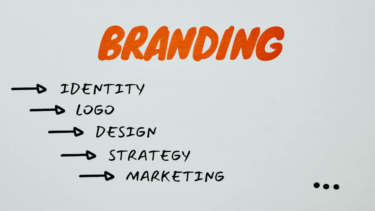
Does My Startup Need a Rebrand Before Fundraising?
A Startup Rebrand before fundraising is needed if your brand misaligns with goals or confuses investors. Assess clarity, timing, and market fit.
Over 90% of purchasing decisions happen below our conscious awareness. This isn’t speculation—it’s how our brains are wired. While we believe we make rational choices, our subconscious mind has usually decided long before we realize it.
Psychology-driven design
transcends mere aesthetics. It’s the strategic application of behavioral science principles to visual elements and user experiences that guide prospects toward conversion. For entrepreneurs launching new brands, understanding these principles creates an unfair advantage against larger competitors who often rely on budget rather than behavioral insight.
Consider how a thoughtfully designed landing page can build trust in seconds, while a poorly conceived one triggers immediate skepticism. This reaction isn’t random—it’s predictable and can be engineered when you understand the psychological principles at work.
The beauty of
psychology-driven design
is that you don’t need a psychology degree to implement it effectively. You simply need to recognize how visual hierarchy, color relationships, and information architecture tap into hardwired human responses.
When brands struggle with conversion, the problem rarely lies in what they offer, but how they present it. The gap between interest and action often comes down to psychological friction that effective design can eliminate.
Understanding cognitive biases—those mental shortcuts we all use to make decisions—is the first step toward creating designs that convert. These predictable patterns of thought influence everything from first impressions to final purchase decisions.

Cognitive biases are mental shortcuts our brains use to process information efficiently. These evolutionary adaptations help us navigate complex environments quickly, but they also predictably influence our purchasing decisions in ways we rarely notice.
The
anchoring effect
demonstrates how first impressions become the reference point for all subsequent judgments. When your homepage establishes a premium positioning, visitors evaluate everything else against that standard. This explains why luxury brands often lead with their most exclusive offerings before introducing more accessible options. In your design, establish value early through professional imagery and thoughtful typography before visitors encounter pricing.
Social proof
reflects our tendency to look to others when uncertain about decisions. We instinctively trust collective wisdom over marketing claims. Effective designs leverage this bias by integrating testimonials at moments of hesitation, not just on dedicated pages where they’re easily overlooked. Customer reviews positioned near purchase buttons or case studies strategically placed at decision points can increase
brand conversion rates
by addressing unspoken doubts exactly when they arise.
The
scarcity bias
explains why limited availability increases perceived value. When something seems rare, we assign it greater importance. Ethical applications include transparent inventory indicators for genuinely limited products or time-bound offers with clear deadlines. The key is authenticity—manufactured scarcity damages trust when discovered.
Other
cognitive biases in branding
worth considering include:
The ethical dimension matters tremendously. These principles should enhance user experience by removing confusion and highlighting genuine value—not manipulating through deception. Effective design helps users make decisions aligned with their actual needs while achieving your business goals.
While biases influence how we process information, emotions ultimately drive us to action. Let’s explore how emotional design elements create the connections that convert visitors into customers.
Neuroscience reveals that emotions process information faster than our rational mind. When someone visits your website, their emotional brain has already formed impressions before their analytical brain engages. This emotional response creates stronger memory imprints than logical arguments, explaining why we remember how brands make us feel long after forgetting their specific claims.
Effective emotional design creates immediate connections through strategic elements like human faces (which we’re hardwired to notice), personal stories that trigger empathy, or aspiration-triggering imagery that helps visitors envision improved futures. These elements create connections that purely functional design cannot match.
Visual hierarchy guides visitors through an emotional journey, not just an information path. When designing for conversion, position your customer as the hero and your brand as the guide. This narrative structure taps into fundamental storytelling patterns that resonate across cultures.
Typography choices subtly communicate personality—serif fonts often convey tradition and reliability, while sans-serif fonts suggest modernity and approachability. Image selection should evoke specific emotional responses aligned with your brand values. For example, close-up photography creates intimacy, while wide landscape shots evoke possibility and freedom.
The most compelling visual stories don’t just show your product—they show the transformation it enables. This before-and-after emotional journey creates powerful motivation to convert.
Emotional consistency across all touchpoints builds trust and reduces cognitive dissonance. When your Instagram projects playful creativity but your website feels corporate and rigid, the disconnect creates subtle unease that undermines conversion.
Conduct regular audits of your brand assets to ensure emotional alignment. Ask: Does each element reinforce our core emotional promise? Do transitions between platforms feel seamless or jarring? Are we maintaining consistent emotional cues while adapting to different contexts?
Key emotional design elements to consider include:
When emotional design aligns with strategic placement of conversion elements, the results can be remarkable. Let’s examine how to optimize those critical decision points.
Choice architecture—how options are presented—significantly influences decision-making. Your call-to-action (CTA) represents the critical moment where psychology most directly impacts conversion rates.
Visual prominence determines whether your CTA registers in the visitor’s awareness. Pattern interruption—creating visual contrast between your CTA and surrounding elements—captures attention naturally without feeling intrusive. This isn’t simply about making buttons larger, but creating meaningful visual hierarchy through strategic use of contrast, size, and white space.
Psychological triggers embedded in CTA design tap into core motivations. Urgency creates immediate action when presented authentically (“Enrollment closes Friday” rather than perpetual “limited time” claims). Exclusivity appeals to our desire for special status or unique opportunities. Benefit-focused language answers the visitor’s unconscious question: “What’s in it for me?”
Friction reduction addresses psychological barriers before they become objections. Anticipate concerns and address them directly through reassurance text near CTAs (“Free to start, cancel anytime”). Clarity improvements eliminate confusion about what happens next, while simplified processes remove unnecessary steps between decision and completion.
Best practices for
optimizing call-to-action
placement include:
Remember that audience psychology varies by industry and brand positioning. Testing different approaches yields more valuable insights than following rigid rules.
| Psychological Principle | Effective Implementation | Ineffective Implementation |
|---|---|---|
| Visual Prominence | High contrast button with whitespace that creates a visual break from surrounding content | Button that blends with page design or competes with multiple other visual elements |
| Urgency Triggers | Specific, believable time limitation (“Enrollment closes Friday”) | Vague or permanent urgency claims (“Limited time offer” that never changes) |
| Value Clarity | Benefit-focused text that answers “what’s in it for me?” (“Start creating your brand”) | Feature-focused or generic text (“Submit” or “Click here”) |
| Friction Reduction | Reassurance text addressing common objections (“Free to start, cancel anytime”) | Hidden information that creates uncertainty about next steps or commitments |
While strategic placement matters tremendously, the visual elements themselves—particularly color—play a crucial role in conversion optimization.
The relationship between color and emotion runs deeper than simple associations. Colors influence our perception of time (warm colors make time seem to pass more quickly), value (darker shades suggest premium quality), and even physical sensations (blue rooms feel cooler than identical rooms painted red).
These responses stem from both neurological reactions and cultural conditioning. While some responses are nearly universal—like increased heart rate with bright red exposure—others vary significantly across contexts. The same vibrant orange that signals “discount” in retail might convey “creativity” in a design context.
The most effective
color psychology for conversions
considers not just individual colors but relationships between colors. Contrast creates emphasis, harmony creates comfort, and unexpected combinations create attention.
Color functions as a powerful conversion tool when used to create visual hierarchies that guide attention. High-contrast colors naturally draw the eye, making them effective for CTAs and key conversion elements. However, contrast must be used selectively—when everything stands out, nothing does.
Background-foreground relationships determine readability and cognitive ease. Text that requires effort to read creates subtle friction that reduces conversion rates. The most effective designs use color to reduce cognitive load rather than creating visual excitement for its own sake.
Color also serves as an intuitive navigation tool, helping visitors understand where they are in a process and what actions are available. Consistent color coding reduces the mental effort required to interact with your brand.
Color meanings vary dramatically across cultures and demographics. White symbolizes purity in Western contexts but represents mourning in many Asian cultures. Red signals danger in some contexts but prosperity and good fortune in others.
For brands with diverse audiences, research target market color associations before finalizing design decisions. This is particularly important for Southeast Asian audiences, where color symbolism often differs significantly from Western interpretations.
Strategic color applications to consider:
The true power of
psychology-driven design
becomes evident when examining real-world applications across different industries.
E-commerce brands face unique conversion challenges with abandoned carts reaching up to 70%. One online retailer addressed this by implementing a psychology-driven redesign focused on scarcity indicators, social proof elements, and simplified checkout processes. They added real-time inventory counters for popular items, integrated customer reviews directly beside product images (not just in a separate tab), and created a streamlined checkout with progress indicators. These changes leveraged scarcity bias, social proof, and the need for cognitive ease, resulting in a 27% increase in completed purchases.
Service businesses often struggle with lead quality rather than quantity. A professional services firm improved their conversion quality by redesigning their lead generation process around authority signals, loss aversion messaging, and strategic form design. They prominently displayed professional credentials and certifications, reframed their free consultation as a “strategy assessment” (something to lose rather than gain), and implemented a multi-step form that gathered information progressively. These changes increased qualified leads by 34% while actually reducing total form submissions—a perfect example of quality over quantity.
SaaS companies face the critical challenge of converting free trials to paid subscriptions. One software company increased their conversion rate by implementing progress gamification, early success moments, and strategic feature revelation. Their onboarding process included completion bars showing advancement, celebrated small wins with subtle animations, and gradually introduced advanced features after users mastered basics. By leveraging the progress principle, endowed progress effect, and peak-end rule, they increased trial-to-paid conversion by 41%.
Local businesses face unique challenges in driving online visitors to physical locations. A small business increased store visits through emotional storytelling, local social proof, and clear action pathways. Their website redesign featured the founder’s personal journey, testimonials from recognizable community members, and location-specific CTAs that emphasized convenience. These changes, rooted in narrative transportation and proximity bias, increased store visits by 38%.
| Industry Example | Key Psychological Principles | Implementation Methods | Typical Results |
|---|---|---|---|
| E-commerce | Scarcity, Social Proof, Cognitive Ease | Inventory counters, Review integration, Streamlined checkout | 15-30% increase in cart completion |
| Service Business | Authority, Loss Aversion, Commitment Consistency | Credential displays, Problem-focused messaging, Multi-step forms | 20-40% increase in qualified leads |
| SaaS Product | Progress Principle, Endowed Progress, Peak-End Rule | Completion indicators, Pre-filled elements, Success moments | 25-45% increase in trial conversions |
| Local Business | Narrative Transportation, Proximity Bias, Identifiable Victim Effect | Founder stories, Location-specific imagery, Customer testimonials | 30-50% increase in store visits or local inquiries |
These examples demonstrate how psychological principles work together as integrated systems rather than isolated tactics. Let’s explore how to apply these insights to your specific brand.
Effective
psychology-driven design
requires understanding your specific audience’s triggers and pain points. The principles we’ve explored work together as an integrated system, not as isolated tactics. Here’s a practical framework for implementation:
1. Audit Current Assets
Evaluate your existing design elements against psychological principles by asking:
2. Prioritize Improvements
Focus first on high-impact, low-effort changes directly connected to conversion points. Often, the most significant gains come from optimizing existing elements rather than complete redesigns. Start with your primary CTA, then address the emotional journey leading to that action point.
3. Test and Refine
Implement A/B testing for psychological design changes rather than relying on assumptions. Even small businesses can conduct simple tests by showing different versions to segments of their audience and tracking conversion differences. Remember that what works for one brand may not work for yours—audience psychology varies significantly across contexts.
Begin with a single, manageable change—perhaps optimizing your primary CTA using the principles we’ve discussed. Measure the results, learn from the data, and build on your success with additional refinements. Psychology-driven design is an ongoing process of understanding your audience more deeply, not a one-time implementation.
By thoughtfully applying these psychological principles, you can create designs that not only look professional but strategically guide visitors toward conversion—turning your brand’s visual identity into a powerful business asset.


You can! But a senior designer can command $30K a month. Also, depending on your needs, they may not be able to do all that’s required. Fractional design partners like LaunchBox bring a range of skills and and a lot of experience for an affordable monthly rate.
Good question. This depends a lot on you, but we can do a lot if we work well together. For example, it’s reasonable for us to deliver a brand, website, merch, presentations, and print/packaging in a month.
No, there are no refunds, but you can pause, cancel, upgrade or downgrade your subscription any time. We also offer a risk-free no-card-needed trial so you can test LaunchBox for yourself!
The source files are yours, and you will have access to them during the entire subscription.
We produce video and animation using Blender and Resolve. We build sites in Framer, and Wordpress. We design using Affinity Designer and Figma. We can also adapt to your needs.
You add tasks to a shared Trello board and we’ll deliver on the task within 48 hours. Tasks are updated and links are added to the board. The board holds everything. We provide task templates so you can see a roadmap for most project types when creating tasks.