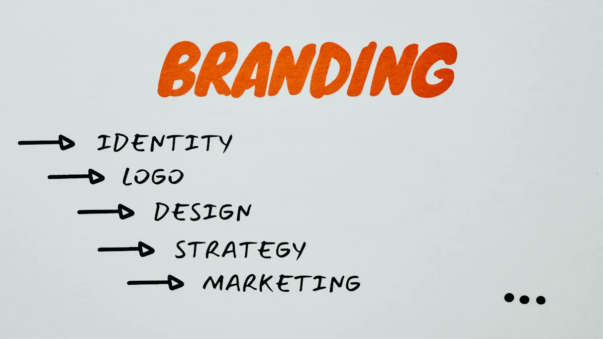
Does My Startup Need a Rebrand Before Fundraising?
A Startup Rebrand before fundraising is needed if your brand misaligns with goals or confuses investors. Assess clarity, timing, and market fit.

Want to see your landing page turn more visitors into customers? You can make a real difference by using proven strategies that work across many industries. Right now, the median landing page conversion rates sit at about 6.6%, but some brands have seen boosts as high as 3,566% by making smart changes.
You can join them. Try these tips and watch your high conversion landing page deliver real, measurable results. Every tip you use can move you closer to top-performing landing page status.
The average landing page conversion rates:
Overall: 2.35%
B2B: 13.28%
B2C: 9.87%
Median: 6.6%
Make your landing page load fast so people stay and buy more. Use simple headlines and clear calls to action so visitors know what to do next. Show social proof like reviews and trust badges to help people trust you and want to buy. Keep forms short with only a few boxes so it is easy for people to sign up or buy. Make sure your landing page works well on phones with layouts that fit and buttons that are easy to find.
You want your business to grow. One of the fastest ways to do that is by improving your landing page conversion rate. When you increase conversion rates, you turn more visitors into leads or customers without spending extra money on ads. This means you get more value from every person who visits your landing page.
A higher landing page conversion rate can lead to big jumps in revenue. For example, some SaaS companies have seen 12-40% year-over-year growth just by making their landing pages better. Even a small boost in conversion rate can double your sales over time. You also save money because you do not need to buy more traffic. Instead, you make the most of the visitors you already have.
Did you know? If your landing page loads slowly, you could lose over half your visitors. Just a 0.1-second improvement in load time can increase conversion rates by 8.4%. Faster pages keep people around and help you earn more.
Landing page conversion rates also affect your ad costs. When your landing page works well, your ads get a better Quality Score. This lowers your cost-per-click and helps you get more customers for less money. If your landing page is weak, you pay more for each new customer. So, a high conversion rate means you spend less and earn more.
You might wonder what makes an effective landing page. The best landing pages share a few key features:
A clear call to action that stands out and tells visitors what to do.
Clean design with lots of white space and easy-to-read text.
Social proof like reviews or testimonials to build trust.
Short, powerful copy that explains the benefits.
Simple forms that are easy to fill out.
High-quality images or videos that show your product or service.
When you follow landing page best practices and focus on these elements, you can increase conversion rates and build an effective landing page that gets results. Testing and improving these parts will help you reach your goals faster.
Your headline is the first thing visitors see on your landing page. If you want a high conversion landing page, you need a headline that is clear and direct. People should know exactly what you offer and why it matters. Avoid vague words like “amazing” or “magic.” Instead, focus on the real benefits. For example, say “Get Faster Results with Our Simple Tool” instead of “Experience Magic Results.”
A strong headline sits at the top of your landing page and stands out. Use big, bold text so no one misses it. Make sure your headline answers these questions: What problem do you solve? What benefit do you deliver? Why should someone care?
Here are some headline formulas that work well for a high-converting landing page:
How-to Headline: “How to Double Your Sales in 30 Days”
Superlative Headline: “The Fastest Way to Organize Your Day”
Special Offer Headline: “Save 20% on Your First Order”
Call to Action Headline: “Start Your Free Trial Now”
These formulas help you keep your message clear and focused on value. You can also use tools like CoSchedule’s Headline Analyzer to check your headline’s strength.
You want your landing page to grab attention right away. Use action words like “discover,” “unlock,” or “start.” These words make people want to take the next step. Adding numbers or specific details also helps. For example, “Unlock 5 Secrets to Better Sleep” is more powerful than “Improve Your Sleep.”
Emotions matter, too. Headlines that make people feel happy or excited work better than those that create fear. Try asking a question to get visitors thinking, like “Ready to Boost Your Productivity?” Social proof can also help. If you have a testimonial or a big customer count, use it in your headline.
Tip: Keep your headline short and easy to read. Most visitors decide to stay or leave your landing page in just a few seconds.
When you use these landing page tips, you set the stage for a high conversion landing page. Test different headlines to see what works best for your audience.
You want your landing page to turn visitors into customers. The secret often lies in your call to action. A great CTA button stands out and tells people exactly what to do next. You should keep the design simple and uncluttered. Use plenty of white space around your CTA so it pops off the page. Pick a color that contrasts with the rest of your landing page. This makes the button easy to spot.
Use action words like “get,” “start,” or “download.” These words push people to take the next step. Short, clear language works best. For example, “Get Your Free Guide” or “Start My Trial” tells visitors what they gain. You can also add urgency, like “Limited Time Offer,” to encourage quick action. Benefit-driven and value-driven ctas help people see what’s in it for them.
Tip: CTA buttons work better than plain text. They can boost clicks by up to 45% and increase conversions by a huge margin.
Make sure your CTA is big enough to tap on mobile devices. Add a simple icon or arrow to draw attention, but don’t overdo it. Test different designs and track which one gets the most clicks. This helps you find the most effective calls to action for your audience.
Where you put your CTA on your landing page matters just as much as how it looks. Place your main CTA near the top, where visitors see it right away. On longer pages, add more CTAs in the middle and at the end. This way, you catch people no matter how far they scroll.
Keep your CTA away from big blocks of text. Use white space to make it stand out. You can also add a short line of text before your CTA to explain why someone should click. If you have customer reviews or testimonials, place them close to your CTA. This builds trust and can boost conversions.
A landing page with strong ctas in the right spots guides visitors toward the action you want. When you combine smart design and smart placement, you set yourself up for more conversions and better results.
You want people to trust your landing page right away. Social proof helps you build trust with visitors. When people see others like your product, they feel sure about buying. Here are some strong types of social proof you can use:
Customer testimonials and reviews: Happy customers share real stories. These show your product works. Testimonials can help conversions go up by 35% compared to only showing company logos.
Company logos: If big brands use your service, show their logos. Docsend got 260% more conversions after adding client logos to their landing page.
Trust icons: Security seals, certifications, and badges help people feel safe. These icons make your landing page look trustworthy.
Endorsements: If a celebrity, influencer, or expert likes your product, share it. Their support can help people trust you fast.
Data and numbers: Show how many customers you have or products sold. Numbers make your landing page look popular and trusted.
Tip: Use different types of social proof together for better results. Each one helps you build trust in its own way.
Where you put social proof matters as much as what you show. You want customers to see proof when they think about buying. Put testimonials and reviews near your main call-to-action. This helps people feel sure and want to click.
Put customer testimonials at the top so visitors see them first.
Add logos of big clients near your headline or CTA.
Use video testimonials or customer photos to make feedback real.
Show trust icons near forms or checkout to build trust at important times.
Keep testimonials new and update them often to stay believable.
A/B testing helps you find the best places for each type of social proof. When you put social proof in the right spots, you get more customer engagement and build trust all through your landing page.

You want your landing page to look great and work fast on every device. Responsive design helps you do that. It makes sure your landing page fits any screen, from a tiny phone to a big tablet. When you use responsive design, your images, text, and buttons all adjust to the right size. This means visitors can read and tap easily, no matter what device they use.
A mobile-friendly landing page loads quickly. Fast loading keeps people from leaving before they see your offer. You should use compressed images and clean code to help your page load even faster. Touch targets, like buttons, need to be big enough—at least 44 by 44 pixels—so everyone can tap them without trouble. A clear call-to-action button should stand out and be easy to find. When you add trust signals, like customer reviews, you build credibility. In fact, 66% of people say they are more likely to buy when they see social proof.
Responsive design can boost your landing page conversion rate. For example, when companies made their call-to-action buttons responsive, they saw a 55% jump in mailing list sign-ups. You want to keep your layout simple and focused. This reduces friction and helps visitors take action. Some experts say that making a separate mobile landing page can sometimes work even better, especially if you want to test different designs for mobile users.
You want your landing page to feel smooth and easy on a phone. Good mobile user experience means visitors can find what they need fast. Here are some ways to make your mobile landing page better:
Use only one form field if you can. This makes it quick for people to sign up.
Make your call-to-action button bright and easy to tap.
Show customer testimonials with real names and photos to build trust.
Add plenty of white space and keep your text short. This helps people read without getting lost.
Remove exit links, like extra logos or menus, so visitors stay focused on your offer.
Use arrows or icons to guide people down the page.
Create a sense of urgency in your words to encourage quick action.
A mobile landing page with these features gives a better user experience and helps increase your landing page conversion rate. Fast load times, simple forms, and clear navigation all play a big part in landing page optimization. When you focus on mobile UX, you lower bounce rates and keep visitors engaged. This kind of optimization can make a huge difference in your results.
Tip: Always test your landing page on different devices. What looks good on a computer might not work on a phone. Small changes can lead to big improvements in your landing page conversion rate.
You want more customers to finish your landing page forms. The best way to do this is to keep your lead capture forms short. When you ask for less information, you make it easier for every customer to say yes. HubSpot looked at over 40,000 landing pages and found that when you add just one extra field, conversions can drop by almost half. That’s a big change! Simple, single-line fields work best. If you use long text boxes or drop-downs, you might lose customers before they even start.
Think about what you really need from your customer. If you only need an email, just ask for that. Shopify does this and sees more conversions because customers don’t feel overwhelmed. Try removing one or two fields from your landing page. You might be surprised by how many more customers finish the form. Always match the number of fields to the value of your offer. If you give away something big, customers might fill out a bit more. But most of the time, less is more.
You want your landing page to look clean and easy for every customer. Visual clarity helps customers focus on your form and finish it. Use lots of white space around your form. This makes it stand out and feel inviting. Place your form where customers can see it right away. Use arrows or icons to guide their eyes to the form. Make your call-to-action button big and bright so customers know where to click.
Use large, clear fonts for your form labels. Customers should never squint or guess what to type. Add a short, benefit-driven message near your form. Tell customers what they get when they fill it out. Remove anything that distracts, like extra links or menus. Show a quick testimonial or review near the form to build trust. Make sure your landing page works well on phones, too. Easy-to-tap buttons and simple forms help customers finish fast.
Tip: Keep your landing page focused on one goal. When you make it easy for customers, you increase conversion and see more happy faces.
You want visitors to notice the most important parts of your landing page right away. Visual hierarchy helps you do this. You can guide attention by arranging elements in smart ways. Here’s how you make your landing page work for you:
Use bigger and bolder fonts for your main message. This draws eyes to what matters most.
Pick high-contrast colors for your call-to-action buttons. Bright colors stand out and make people want to click.
Place key content above the fold. People see it first, so they know what to do next.
Add white space around important sections. This makes each part easy to spot and keeps things from feeling crowded.
Use arrows or images that point to your offer or form. These cues help visitors move through your landing page naturally.
When you set up your landing page with these steps, you create a flow that matches how people think. Visitors find what they need fast, feel less confused, and are more likely to take action.
Tip: Group related content together and keep your layout simple. This helps users process information quickly and boosts your conversion rate.
Readable fonts make your landing page easy to scan. You want everyone to understand your message without effort. Choose fonts that are clear and large enough for all screens. Avoid fancy or thin fonts that are hard to read. Stick to simple styles like Arial, Helvetica, or Roboto.
White space plays a big role here. It gives your text room to breathe and separates sections. When you use enough space, your landing page feels calm and inviting. People can focus on your headline, your offer, and your call-to-action button. This makes your message stronger and helps users move through your landing page without getting lost.
A clean design with readable fonts and smart use of white space can turn visitors into customers. You make your landing page feel friendly and easy, which encourages people to stay and take action.
You want your landing page to load fast. Speed is very important. If your page loads slowly, people leave before seeing your offer. Fast pages keep visitors on your site and help your conversion rate go up. Even a one-second delay can lower your conversion by 7%. Look at the table below to see how page load time changes conversion rate and bounce rate:
Page Load Time (seconds) | Conversion Rate (Ecommerce) | Conversion Rate (Lead Generation) | Bounce Rate |
|---|---|---|---|
1 | 3.05% | 39% | 7% |
2 | 1.68% | N/A | N/A |
3 | N/A | N/A | 11% |
5 | 1.08% | 18% | 38% |
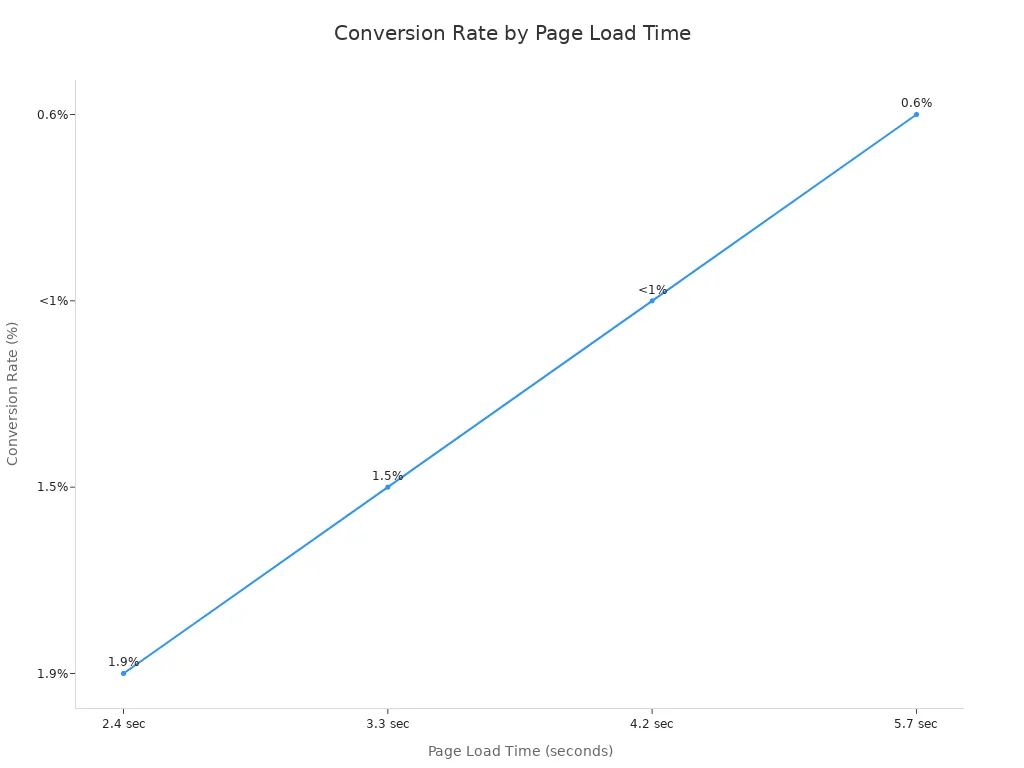
A landing page that loads in one second gets more conversions than slower pages. Faster pages also have fewer people leaving right away. If you want to improve your conversion rate, focus on making your page faster.
There are many tools to help you test and speed up your landing page. Here are some of the best ones:
Tool Name | Key Features & Capabilities | Unique Advantages |
|---|---|---|
GTmetrix | Combines Google PageSpeed and YSlow recommendations; performance scores; waterfall charts; mobile testing; HTTP/2 support. | Multiple test locations; mobile device testing; detailed breakdowns. |
Pingdom | Tests from 3 locations; performance grade; shows load time, page size, requests; content breakdown. | Simple insights; site comparison. |
Google PageSpeed Insights | Scores pages 0-100; desktop and mobile reports; user experience metrics. | Official Google tool; actionable recommendations. |
WebPagetest | 40+ test locations; 25+ browsers; connection throttling; video capture; HTTP/2 support. | Advanced testing; detailed grading. |
Dotcom-Monitor | 20 test locations; 7 browsers; simultaneous geographic tests; error diagnostics. | Multiple geographic tests; comprehensive diagnostics. |
Pagelocity | Scores out of 100; content summary; resource breakdown; competitive analysis. | Competitive benchmarking; code insights. |
YSlow | Open source; analyzes Yahoo’s 23 rules; improvement suggestions; Chrome extension. | Rule-based grading; integration with other tools. |
You can also use PageVitals to watch your speed in real time. Zuko helps you make your forms better. These tools show you what is wrong and help you fix it fast. They make it easier to improve your landing page and reach your goals.
You want easy ways to make your landing page faster. Try these simple tips to help your conversion rate:
Turn on gZIP compression to make files smaller and load faster.
Use a Content Delivery Network (CDN) so your page loads from servers near your visitors.
Minify and combine CSS and JavaScript files to make them smaller and cut down requests.
Use lazy loading for images so only pictures on the screen load first.
Limit how many plugins you use, especially on WordPress, to avoid slowing down your page.
Remove plugins you do not use to keep your page quick.
Turn on browser caching so people who visit again load your page faster.
Make image sizes smaller and keep good quality for faster loading.
Cut down on redirects to stop extra waiting.
Put CSS files at the top and JavaScript files at the bottom of your HTML for smoother loading.
Tip: Even a small speed boost can help a lot. Deloitte found that just 0.1 seconds faster made conversions go up by 8.4%. Vodafone got 8% more sales after making their site faster. Nood saw a 24% better conversion rate by speeding up their landing page.
When you use these tips, your landing page loads faster and your conversion rate can go up. Fast pages make visitors happy and help you get more customers. Keep testing and improving to get the best results for your landing page.
When someone lands on your page, you want them to know right away what’s in it for them. That’s where a strong value proposition comes in. You need to show the benefits clearly and quickly. People trust you more when you explain exactly how your product or service helps them. If you make your benefits easy to understand, visitors feel confident and ready to take action.
A clear value proposition does a few important things for your landing page:
It builds trust by showing you understand what people need.
It helps visitors see the unique benefits you offer.
It gives people a reason to act now, not later.
It keeps things simple, so no one feels confused.
It matches your headline, call to action, and images, creating a smooth experience.
If your value proposition is weak or missing, people might leave your landing page without doing anything. You want to avoid that. Focus on demonstrating value by using short sentences and real examples. Show how your product saves time, solves a problem, or makes life easier. When you highlight these benefits, you make it simple for visitors to decide.
Tip: Keep testing your value proposition. Ask customers what they like most and update your landing page to match their needs.
You want your landing page to stand out from the crowd. To do this, focus on what makes you different. High-converting landing pages use bold headlines, clear subheadlines, and strong calls to action. They also use social proof, like testimonials and trust badges, to show real people love your product.
Try demonstrating value by showing your team or sharing a quick video. This helps visitors connect with you. Use limited-time offers or special deals to create urgency. Make sure your landing page loads fast and looks great on phones. Add interactive tools, like calculators, to keep people engaged.
A simple table can help visitors compare your benefits to others:
Your Page | Competitor |
|---|---|
Fast load | Slow load |
Real reviews | Few reviews |
Clear benefits | Confusing message |
Keep your landing page clean and easy to use. Place your main message above the fold, so everyone sees it first. Test different headlines and calls to action to see what works best. When you focus on what makes you unique, you help visitors choose you over the competition.
You want your landing page to feel simple and friendly. Too much information can make people leave before reading your offer. When you keep your content short, visitors understand your message quickly. About 30% of landing pages lose conversions because they have too much text. You can stop this by sharing only what is important.
Focus on the main offer.
Take out extra words or details.
Use short sentences and easy words.
Do not use too many images or graphics.
If you offer an e-book, you do not need a long story. A quick summary, a nice cover image, and a clear call to action work best. This helps your customer decide fast. When you keep things simple, you get more conversions and keep your conversion rate high. Less is better when you want more people to say yes and feel sure.
Tip: Pages with too much stuff confuse people. Clean, short content brings more conversions and a better conversion rate.
You want your customer to remember the most important things. Highlighting key messages helps you guide them to take action. Use bold headlines and short bullet points to make your ideas stand out. A strong headline gets attention and tells your customer what they get. Add a few quick facts or benefits to support your message.
Design is also important for conversion rate optimization. Use white space to split up sections. Pick colors that make your call to action stand out. Add trust signals like testimonials to show real customer success. Fast loading and mobile-friendly design help your customer stay focused on your offer.
Here’s a simple way to highlight key messages:
What to Do | Why It Works |
|---|---|
Use bold headlines | Grabs attention |
Add bullet points | Makes info easy to scan |
Show testimonials | Builds trust with the customer |
Use clear CTAs | Guides the customer to conversion |
When you keep your landing page simple and highlight key messages, you get more conversions and help every customer take action. Good conversion rate optimization always puts the customer first and makes every step easy to follow.
You want your landing page to look great. Good images and videos help with this. People see pictures before they read words. Sharp, bright images that match your brand make your page look professional. Bad images can make visitors leave quickly.
Videos can help your landing page get up to 86% more conversions.
Videos catch attention better than words or still pictures.
The brain understands pictures faster than words, so people get your message quickly.
Videos with real people help build trust and make your brand feel friendly.
Emotional videos can help people decide to buy and stay on your page longer.
Different videos, like explainers or testimonials, work best when you put them where they fit your goals.
Videos made by users often make people feel better about your brand.
Good, useful images keep people interested and support your value proposition.
Putting images at the top or near product details helps guide attention and makes people feel connected.
Pictures of real people using your product make your page feel honest and trustworthy.
Tip: Always make your images the right size and format. Compress them so your page loads fast. Fast pages keep people from leaving and help you get more conversions.
You want visitors to see why your product is good right away. Pictures and videos show this better than words. When you show your product being used, people see how it works and why it matters. Photos of your product, your team, or your packaging help customers relate to what you offer.
Pictures that tell a story or use color to make people feel something can make your product seem more valuable. For example, using special images that show your product’s features can help you get 13% more conversions. Infographics and charts help explain hard ideas quickly, so your offer is easy to understand.
Videos and real photos build trust and show your brand’s style. When you use pictures that feel real, you make it easier for visitors to connect with your product. They feel sure about buying and take action faster. This simple change can help more people pick you instead of others.
You can make your landing page better by using these tips. Follow landing page best practices to help your conversion rate go up. Keep testing and look at important numbers like conversion rate and bounce rate. Check how many people take action on your page. When you build trust, customers feel sure and want to act. You can use AI-powered tools or ask experts for more help. Every change you make helps you build trust and connect with your customer. These changes also help you get better results.
Keep working to improve. Watch your progress and let your landing page turn visitors into happy customers!
Your landing page conversion rate shows how many visitors take the action you want, like signing up or buying. You can find it by dividing the number of conversions by the total number of visitors, then multiplying by 100.
You can make your cta stand out by using bright colors, big buttons, and clear words. Place your cta where people see it fast. Try using action words and a strong call to action that tells visitors exactly what to do.
A call to action tells your visitors what to do next. Without it, people might leave your page without taking any steps. A clear cta helps guide them and boosts your chances of getting more conversions.
You can use more than one cta if your page is long. Place a cta at the top and another near the bottom. This way, visitors always see a clear next step, no matter where they are on your page.


You can! But a senior designer can command $30K a month. Also, depending on your needs, they may not be able to do all that’s required. Fractional design partners like LaunchBox bring a range of skills and and a lot of experience for an affordable monthly rate.
Good question. This depends a lot on you, but we can do a lot if we work well together. For example, it’s reasonable for us to deliver a brand, website, merch, presentations, and print/packaging in a month.
No, there are no refunds, but you can pause, cancel, upgrade or downgrade your subscription any time. We also offer a risk-free no-card-needed trial so you can test LaunchBox for yourself!
The source files are yours, and you will have access to them during the entire subscription.
We produce video and animation using Blender and Resolve. We build sites in Framer, and Wordpress. We design using Affinity Designer and Figma. We can also adapt to your needs.
You add tasks to a shared Trello board and we’ll deliver on the task within 48 hours. Tasks are updated and links are added to the board. The board holds everything. We provide task templates so you can see a roadmap for most project types when creating tasks.